- COMPETITIONS
- THE COMPETITION ARCHIVES
- THEME BUILD OFFS
- WINTER 2017 BUILD OFF - ANYTHING GOES!
- WBO 2017 FINISHED BIKES
You are using an out of date browser. It may not display this or other websites correctly.
You should upgrade or use an alternative browser.
You should upgrade or use an alternative browser.
1952 Western Flyer WBO '17
- Thread starter mykainsbroken
- Start date

Help Support Rat Rod Bikes Bicycle Forum:
This site may earn a commission from merchant affiliate
links, including eBay, Amazon, and others.
Nice work!
Make sure that your top picture is the one you want used for voting though.
Make sure that your top picture is the one you want used for voting though.
Really nice!

Welcome to the 'Finished' line! Nice, ratty build. Looks like a great rider too!
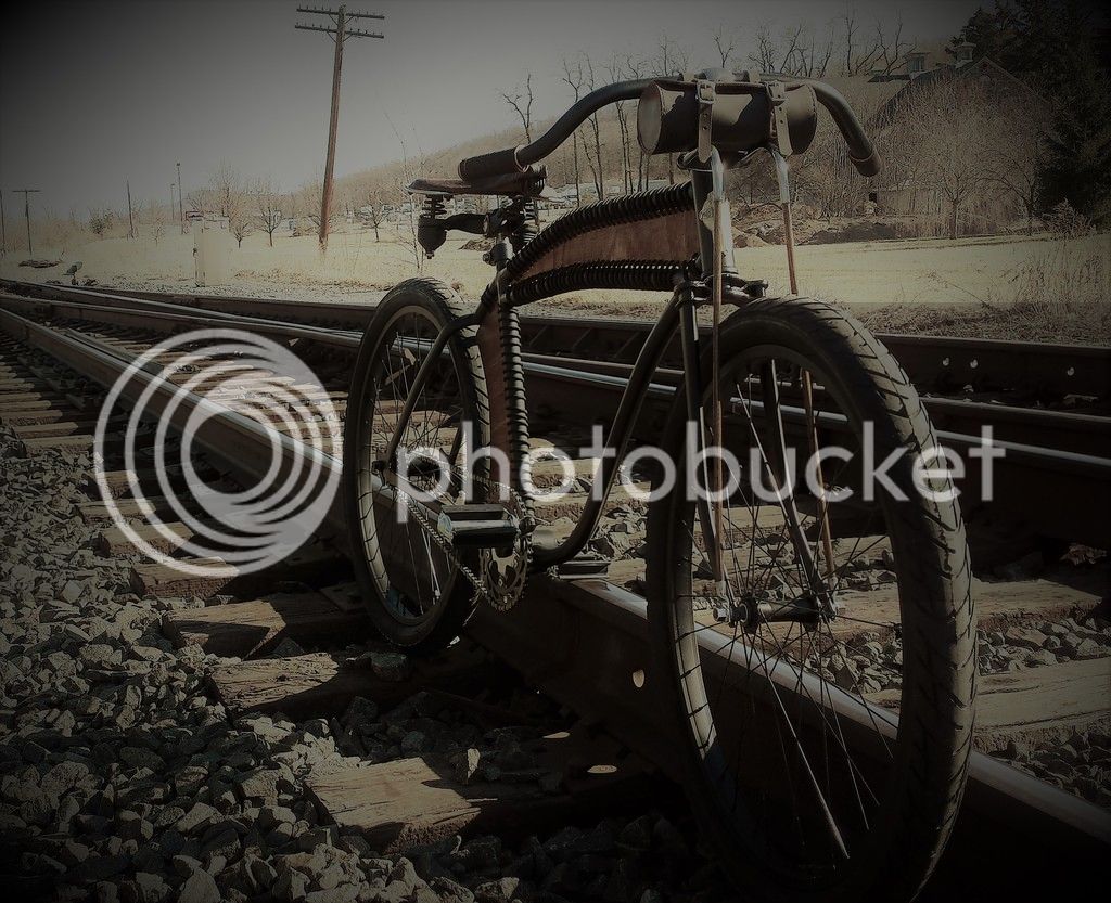
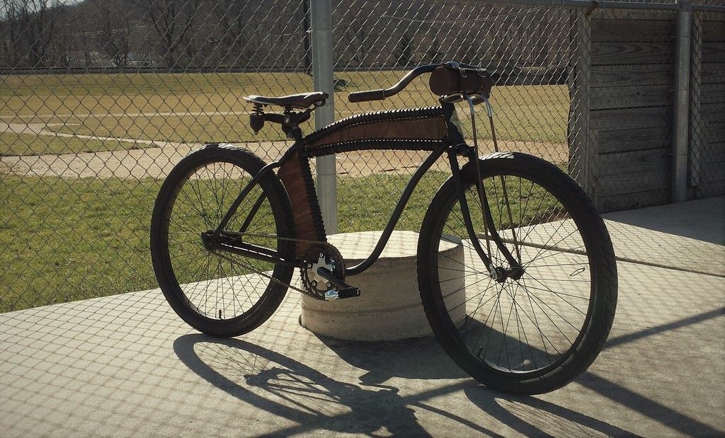
I agree with Luke, your best pic should be at the front of the thread, that will be the one used for voting. I like this one, I cropped it a little to make the bike stand out more....

I agree with Luke, your best pic should be at the front of the thread, that will be the one used for voting. I like this one, I cropped it a little to make the bike stand out more....

Hey! Thanks! Im not a good photographer. I took about 15 pics in a few areas around town and just couldn't find one I liked. I appreciate you taking the time to do that for me.
$199.99
$229.99
Huffy Stone Mountain Women's Mountain Bike, Gray, 26 Inch Wheels/17 Inch Frame
HuffyDirect
$249.40
$289.67
Kulana Lakona Tide Adult Beach Cruiser Bike, 26-Inch Wheels, 7-Speed, Silver
Amazon.com
$18.99
Old River Outdoors Bicycle/Motorcycle Chain Picture Frame 4" X 6" Photo - Faux Bike Chain
Old River Outdoors (USA Merchant)

$99.99
$108.99
Schwinn Toggle Quick Build Kids Bike, 12-Inch Wheels, Smart Start Steel Frame, Easy Tool-Free Assembly, Blue
easiness

$19.99
Electra Glide Wall Decal 2ft Long Sport Harley Davidson Bike Motorcylce Sticker Man Cave Garage Boys Room Decor
FatCat Wall Graphics
A.S.BOLTNUT
He who dies with the most toys ,still dies No Fear
Looks good.


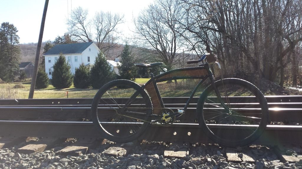
Thanks for your input! Your right it looks better cropped. I added a another one I took by the tracks.
That second from the top picture is awesome! Well placed angle for the bike, and the perspective of the track and coloring overall is your money shot! I'd go with that one.Thanks for your input! Your right it looks better cropped. I added a another one I took by the tracks.
That second from the top picture is awesome! Well placed angle for the bike, and the perspective of the track and coloring overall is your money shot! I'd go with that one.
Agreed!
Good picture...Maybe lighten it up a bit. Best pictures get the most votes. (not always the best bikes) used to drive me crazy til I got used to it and realized the best bike was in my garage anytime I wanna go ride it. [emoji469]
[emoji450]
sent from a banana phone...
[emoji450]
sent from a banana phone...
that's one mean looking rugged ride...love this bike
I think the photo is good cropped tight (post#7), I agree with Carl, lighten it up a bit, maybe vignette the background, it draws more attention to this beauty..sortof puts it in the spotlight, if you know what I mean

franco
I think the photo is good cropped tight (post#7), I agree with Carl, lighten it up a bit, maybe vignette the background, it draws more attention to this beauty..sortof puts it in the spotlight, if you know what I mean

franco
that's one mean looking rugged ride...love this bike
I think the photo is good cropped tight (post#7), I agree with Carl, lighten it up a bit, maybe vignette the background, it draws more attention to this beauty..sortof puts it in the spotlight, if you know what I mean
franco
I appreciate the good words. I agree with you guys on the making the image lighter and so on, but Ill be keeping what I have here. The first post has probably been edited 6 times now. lol The first pic is a good representation and my skills are sub par.
Besides, Im not sure I put this much thought into making the darn thing.
Have a good day!
I have to say I like your first pic. To me it shows action like a locomotive rolling down the tracks.
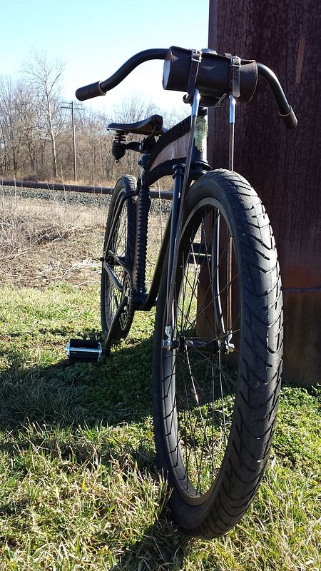
I took the liberty to mess around with the image, tried to make it look older and added some wear to the tire tread...

I took the liberty to mess around with the image, tried to make it look older and added some wear to the tire tread...

Nice H.F. ...snaps it up quite a bit.I have to say I like your first pic. To me it shows action like a locomotive rolling down the tracks.
I took the liberty to mess around with the image, tried to make it look older and added some wear to the tire tread...
View attachment 48193

Great Bike great Build! It looks all business!
- Joined
- May 6, 2016
- Messages
- 517
- Reaction score
- 1,441
Take this pic to the top!I have to say I like your first pic. To me it shows action like a locomotive rolling down the tracks.
I took the liberty to mess around with the image, tried to make it look older and added some wear to the tire tread...
View attachment 48193
Nice bike man, really we done !
Funkme
𝐰𝐰𝐰.𝐟𝐫𝐮𝐢𝐭𝐜𝐚𝐤𝐞.𝐧𝐮𝐭
Bravo some nice touches on this bike.
Nice work man!
How about "Freaking LACER Beam" for a name
How about "Freaking LACER Beam" for a name


