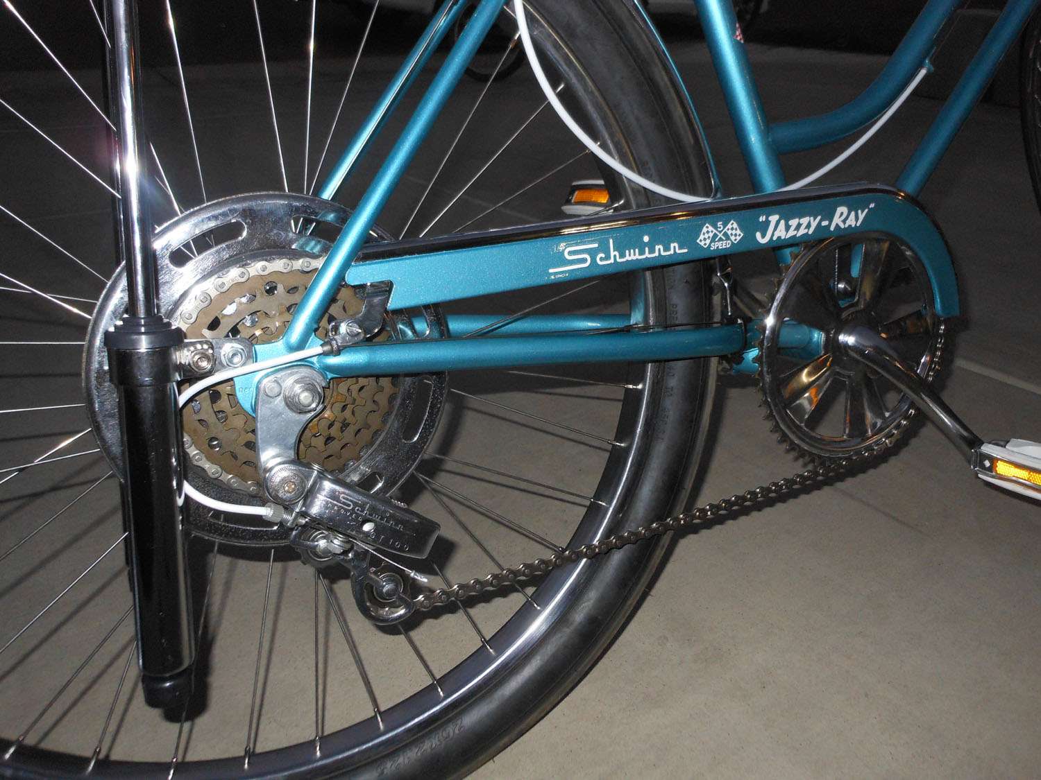
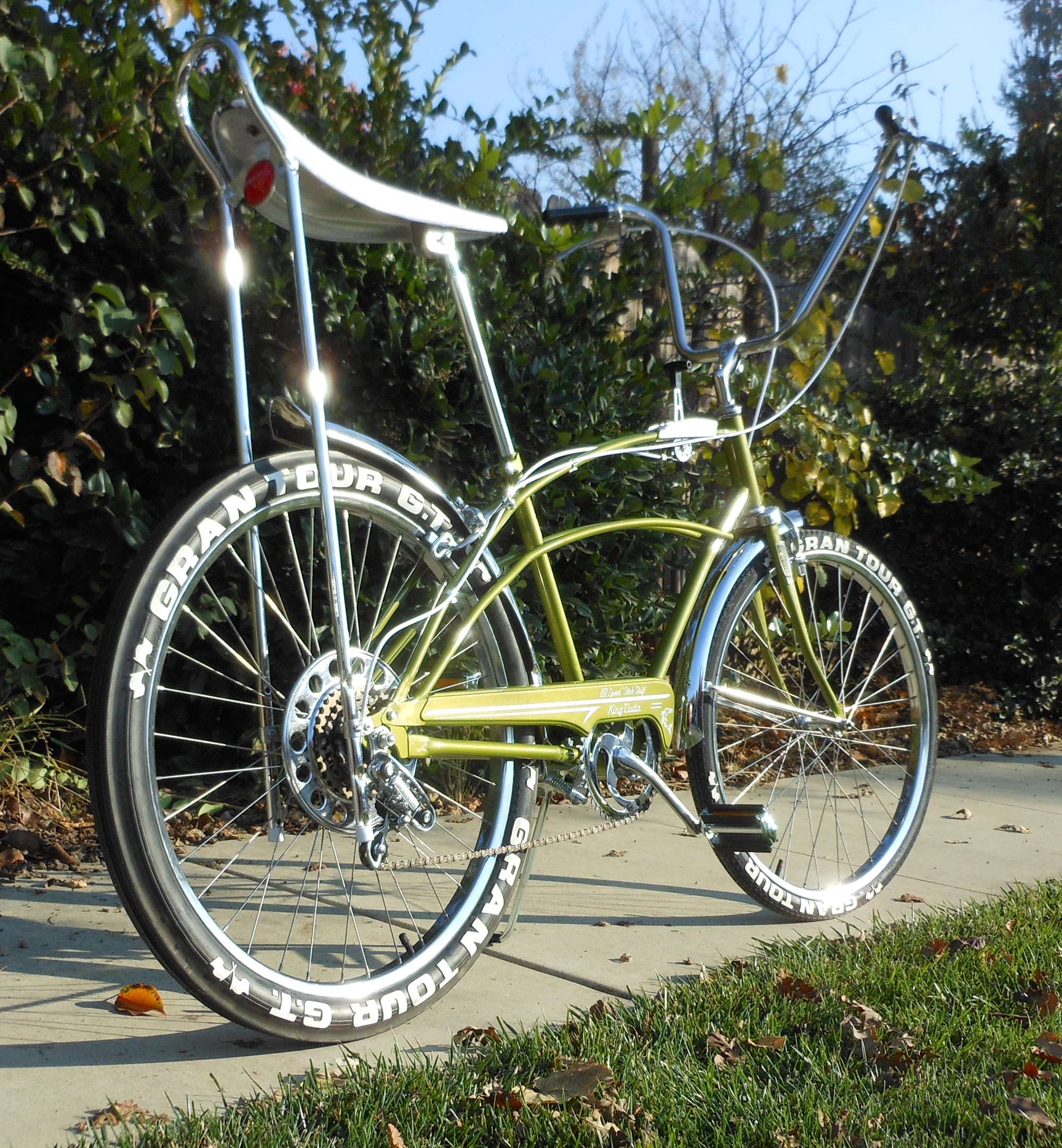
chain guard graphics with a laser cutter... Schwinn font? vector graphics?

Rat Rod Bikes Bicycle Forum

Help Support Rat Rod Bikes Bicycle Forum:

This site may earn a commission from merchant affiliate links, including eBay, Amazon, and others.
Joined
Sep 13, 2006
Messages
1,477
Reaction score
4,657
Location
southern PA
Rating - 100%
2   0   0
has anyone tried this? how did it turn out? I am actually looking to create a phantom model (no, not THAT kind of Phantom) that Schwinn never made, and I'd like to use a font similar to what Schwinn used on the guards for Sting Rays and Racers and Panthers and bikes like that in the '60s. Actually, a perfect example is @CRASH 's Monster Ray. (How DID you do that guard anyway, Crash?) Trying not to break the bank, and I know a few people now that have laser cutters who could do the graphics in vinyl for me. I'd like to bring them a graphics file ready to go. But I'm trying to figure out where to start... what program would I use to create that file?

Also, is there a readily available font that's pretty close? I found this free one called Flash Bold that's kinda the right idea, but I wondered if there's something better out there.

So far this is what I have, and I'm sure I'm not doing it right... I thought using PNGs would leave the whole background transparent, but there's still those white blocks around the elements I added. (That's not the name I want to use, I'm just putzing around at the moment.) Hoping to actually get the finished product done in white.

20181115_094713.jpg


thanks for any advice or guidance...
 
Last edited:
I'd suggest a program like Inkscape that works natively with SVG vector objects. Unlike PNG, these files store the image mathematically and can scale the result without any "jaggies." I think most cutters can use these files without conversion. Unfortunately, that free software comes with a bit of a learning curve.

With PNG images, those boxes do disappear when I set my transparency color to "white." If working with water-slide decals, I generally set the background to closely match the bike's color.

That font is about as close as I've seen to the one that Schwinn actually used. If there is something better, I want to know what it is, too!

https://inkscape.org/about/

Edit: I did some poking around and found another font called "Tragic Marker" that, to my eye, is slightly closer to what Schwinn originally used...though it is not quite a perfect match.

KRATE.png
 
Last edited:
I'd suggest a program like Inkscape that works natively with SVG vector objects. Unlike PNG, these files store the image mathematically and can scale the result without any "jaggies." I think most cutters can use these files without conversion. Unfortunately, that free software comes with a bit of a learning curve.

With PNG images, those boxes do disappear when I set my transparency color to "white." If working with water-slide decals, I generally set the background to closely match the bike's color.

That font is about as close as I've seen to the one that Schwinn actually used. If there is something better, I want to know what it is, too!

https://inkscape.org/about/

Edit: I did some poking around and found another font called "Tragic Marker" that, to my eye, is slightly closer to what Schwinn originally used...though it is not quite a perfect match.

View attachment 86455

Tragic Marker, huh? I will check that out.

Turns out that the online image editor I was using (lunapic.com) has an option to make the background of images you upload transparent, I just hadn't found it yet. I did manage to get a draft together to send to my brother, who has one of the laser cutter whatever printers, and he is going to see what he can do with it.

20181115_134944.jpg


You got my attention with the waterslide decals. Years ago (10? 15?) I tried making waterslide decals for HO scale slot cars. At the time, you could get decal paper for inkjet printers that you then had to seal with a spray sealer before using the decals, or you could get decal paper for laser printers that always had me holding my breath as to whether it was going to melt all over the drum of the printer at work and require the mean and nasty office manager to make a service call to the copier repair guy (don't ask). And after all that, the inks were translucent, which meant they only really looked good if you put them on a white or very light surface. Then there was something called an ALPS printer, which none of us basement hobbyists could afford, that used opaque inks or dyes. So I pretty much gave up.

Has DIY waterslide decal making changed since then? What kind of printer/paper/materials do you use?

thanks again...
 
Last edited:
Has DIY waterslide decal making changed since then? What kind of printer/paper/materials do you use?

thanks again...

I'll respond to all your concerns, here, when I get a chance. Will need to organize my thoughts because the answer may be a long one.

Meanwhile...I think you're already on the right track for this particular application.

EDIT: ***************************************

Since you invited, I'm back to give my perspective on these various subjects. As usual, these observations are not the only way to complete a task...or, maybe not even the best way. However, they are A way--consider them as you will.

First and foremost is the chainguard graphic. You're on the right track there because the final image will be monochrome in either white, black, or red. This is an area where vinyl transfer can really show its stuff. The proposed lettering you provided in Lunapic looks near perfect. My only concern is whether or not your brother's plotter/cutter can accommodate the PNG format. If it does, then your quest is over. If it does not do well, then I suspect SVG vector graphics is the way to go. Vinyl cutting is also a great avenue for making stencils--you can't do THAT with waterslide.

Understand that the cutting machine is trying to trace the outline of any letters and logos, and this is exactly how vector graphics presents its path data. Raster, on the other hand, "paints" an image dot-for-dot and attempts to trick the viewer's eye by means of dithering. A robot arm may not be fooled as easily, nor respond with favor.

I spent an hour or so futzing with Inkscape last night. As I mentioned earlier, the learning curve can be quite intimidating--I'm hardly an expert. There are many tutorials, and one need only learn enough to manipulate text. As you can see in my example, I was able to start with typed-in text, then proceed to deform the Tragic Marker font...one point at a time...into something MUCH closer to what Schwinn genuinely used. That chore was not as challenging as one might guess. With practice, the results would become even better.

bitmap.png

(I left the E unchanged for comparison.)

Now, for the topic you've been eagerly awaiting--waterslide decals. This is of the few DIY techniques suitable for very intricate and/or multicolored transfers. (I suppose one could silk-screen, but that, too, is a messy proposition.)

As you pointed out, the ALPS printer is only practical equipment dedicated to this style of work, and comes with a price tag to match. Unless you're wealthy, have a buddy who owns one, or are willing to hire-out to a professional service bureau, you're probably S-O-L.

My former solution was to use a Tektronix Phaser III printer at the workplace.

tektronix-phaser-iii-color-inkjet-printer-large-format-4698pxi-1.18__09903.1489920102.jpg

This printer was a little unique in that it is fueled by what are, essentially, large "crayons." Those dyes would get deposited onto the sheet much like an inkjet, but due to its waxy nature, the colors were both opaque and vibrant. Unfortunately, these corporate monsters were always expensive to buy, expensive to operate, and had the footprint of a large washing machine. Oh...and they couldn't print white. Back to square one...

Of the two remaining consumer technologies, I'd prefer laser if I could get it. Rumor has it that the price on color laser has dropped precipitously, with some units offered for $100 or less. Inkjets aren't necessarily bad, but I never get my money's worth because the ink dries out--ink that demands the topcoat to become waterproof. Regardless of your choice, you must still address the "no-white" issue.

That isn't as problematic as you might think. The cure is to employ white decal paper, but in a specific way. I'll explain the way I do it in my next entry...
 
Last edited:
WOW. Thanks for your insight on this.

First and foremost is the chainguard graphic. You're on the right track there because the final image will be monochrome in either white, black, or red. This is an area where vinyl transfer can really show its stuff. The proposed lettering you provided in Lunapic looks near perfect. My only concern is whether or not your brother's plotter/cutter can accommodate the PNG format. If it does, then your quest is over. If it does not do well, then I suspect SVG vector graphics is the way to go. Vinyl cutting is also a great avenue for making stencils--you can't do THAT with waterslide.

Thanks, and this or some version of it is what I think I will ultimately be going with. He told me that if I can get him a PNG file, he can convert it to to what the machine needs. So I sent him what I had and we'll see where it goes. I also REALLY like the idea of a stencil to maybe spray the guard graphics in white... sounds like I'd need to practice on scrap a couple of times.

I spent an hour or so futzing with Inkscape last night. As I mentioned earlier, the learning curve can be quite intimidating--I'm hardly an expert. There are many tutorials, and one need only learn enough to manipulate text. As you can see in my example, I was able to start with typed-in text, then proceed to deform the Tragic Marker font...one point at a time...into something MUCH closer to what Schwinn genuinely used. That chore was not as challenging as one might guess. With practice, the results would become even better.

View attachment 86471
(I left the E unchanged for comparison.)

What you did there is pretty amazing. I was looking and comparing fonts, and while the Flash Bold I found is close for some models (Panther, Hornet, like that) I think you're right about Tragic Marker being closer for Krates. Not sure which look I want to go with, but it never occurred to me that whatever I use could be tweaked even closer. I may have to play with Inkscape a little too.

Now, for the topic you've been eagerly awaiting--waterslide decals. This is of the few DIY techniques suitable for very intricate and/or multicolored transfers. (I suppose one could silk-screen, but that, too, is a messy proposition.)

As you pointed out, the ALPS printer is only practical equipment dedicated to this style of work, and comes with a price tag to match. Unless you're wealthy, have a buddy who owns one, or are willing to hire-out to a professional service bureau, you're probably S-O-L.

My reason for thinking about waterslide decals is basically that I've seen lots of folks ask whether to use waterslide or vinyl in restorations, and the answer is always that the waterslides lay flatter and present a finish closer to what would have come from the factory. I recently bought a couple off eBay to pretty up the Slimline tank on one of my junkers, and I was impressed with the results. Honestly, though, if I can pull off a fairly convincing image in vinyl that looks good from 10 feet, I'll be thrilled. Most of my RRB'ing is bolting together new combinations of parts from the crap I have collected in the basement. I don't weld, and my painting is limited to whatever I can do with a rattle can. This is probably the most ambitious project I've taken on (and I don't even have the bike yet! the plan is to pick it up Thanksgiving weekend) and I definitely don't need to get involved with costly one-off waterslides for it. As long as it looks presentable enough to send in some pictures for entry in the current MBBO, which will be my first build-off ever, I'm good.

That said...

... Regardless of your choice, you must still address the "no-white" issue.

That isn't as problematic as you might think. The cure is to employ white decal paper, but in a specific way. I'll explain the way I do it in my next entry...

looking forward to hearing how this works. I have always wondered how it's done...

thanks again for your detailed response!
 
...a perfect example is @CRASH 's Monster Ray. (How DID you do that guard anyway, Crash?)...
Bruce Crawford. [email protected] He took the existing "Krate" file, changed the lettering, and done. Wasn't too expensive. I did it for a friend's Daughter's bike as well.

NxbNfn.jpg


He also took an original Ross Barracuda chain guard to measure it out and scan all the graphics. He then expanded the dimensions and expanded graphics to fit a larger 26" guard for my "King 'Cuda"

Jx7yHZ.jpg

2V8mGs.jpg


2uQSYL.jpg
 
Bruce Crawford. [email protected] He took the existing "Krate" file, changed the lettering, and done. Wasn't too expensive. I did it for a friend's Daughter's bike as well.

NICE. Amazing, actually, how much it looks like they came from the factory that way. Are they waterslide decals or vinyl?
 
looking forward to hearing how this works. I have always wondered how it's done...

Sorry for the delay, but many of my past examples were destroyed in a hard drive crash--I had to create some more and find a way to display them properly here.

The basic premise to creating white decals is actually pretty simple. Create your image as a transparent PNG; a task you've already mastered. Once complete, proceed to cut that image and place it, as an overlay, atop a color swatch that as closely as possible matches the surface to which the decal will be applied. In this example, I've chosen metalflake green to demonstrate that one isn't restricted to solid colors. The final background could be just about anything that can be painted or digitized. Selecting the right color may involve using paint charts, photographs, or even scanning the actual item. (You can always test-print and compare the image on regular paper first.)

At this point, you could probably get away with simply saving and printing the results, but I go to extra step of trimming the surround and setting all "pure white" areas as transparent--the white decal film will show through these spaces. Trim carefully around the perimeter and the background should blend in nicely.

NeoPaint_2018-11-20_09-58-22.png
 
Sorry for the delay, but many of my past examples were destroyed in a hard drive crash--I had to create some more and find a way to display them properly here.

The basic premise to creating white decals is actually pretty simple.
View attachment 86552

Ok, that's a VERY cool method. I will be getting the bike Thanksgiving weekend. I will have to see if I can find a color to match the paint. In the meantime, I have been fooling around with and tweaking different versions of the graphics... I think I have something I really like now. All I gotta do now is get it printed, either on decal paper or in vinyl...

thanks for taking the time to explain and illustrate!
 
thanks for taking the time to explain and illustrate!

My pleasure, friend! Just an opinion, but I think the vinyl cutter would work just fine as your mono-color chainguard solution. Where the white waterslide works best is when the subject is either complex, colorful, or both. The white decal film promotes weak colors, such as yellow, and allows them to to pop on dark backgrounds.

cwc.jpg


Multi-color in vinyl usually means layering...and that just doesn't go around here.
 
20180601_141436.jpg
I did these on a laserjet on clear decal paper and excel. Schwinn logos are screen shots from computer. If you look up "air conditioner" font its a close match to schwinn scrip, but the S isnt stretched out.

White will take some high end equipment.
 
Last edited:
wow... just looked up that font and it's pretty amazing how close it is. Gonna try to play with it. This weekend for the holidays I saw my brother and sister-in-law with the Cricut machine that cuts vinyl, and my sister-in-law talked my wife into buying a machine for herself. SCORE! It will be here in the next couple days and then I will try my hand at making the vinyl ones myself.
 
so I gave this a shot...

kind of excited. I think with a little practice I can get these to come out pretty good.

this came in the mail today:
20181128_211622.jpg


they send you to their setup website to get the product registered and all that good stuff, then they drop you in the sandbox. within a little while I had this:
20181128_225643.jpg


I used a font called KTF Roadbrush that I downloaded for free. You have to fudge it a little to get to this point, but it's not hard. It started out more like this (for whatever reason, it didn't recognize the space bar):
20181129_004443.jpg


Then I had to space the letters together a little (there's a setting at the top called Letter Space), leave a space between Mango and Krate, flip the first set of quotes, and make the M and the K bigger. To do that, I ungrouped the letters and worked with them individually, then regrouped them till I got here:
20181129_004847.jpg


At first I couldn't figure out how to skew the letters to look more like Schwinn script, but a woman on YouTube was kind enough to show me. Basically, you rotate the whole name about 30-45 degrees using the Rotate button at the top right of the selection.
20181129_004924.jpg


Then you unlock the height/width ratio by clicking the lock at the lower left of the selection, which lets you change the proportion of the height and width by dragging the arrow at the lower right. Play with it till the letters are tilted the way you want.
20181129_004956.jpg


Now when you grab the Rotate handle at the top right and bring the text back around to level, you get something that looks kinda like Schwinn might have used it:
20181129_005015.jpg

(this step was so easy that it bugged me that I needed to look it up to figure it out lol)

Anyway, you can click a "Make It" button at the far top right of your project at any time and the program will tell you to turn on the Cricut, to stick your vinyl to the backing board, to place it in the machine and press the Load button, and then when it senses it's all initialized and ready, to press the Start button and watch your machine blade dance around and cut.

I don't know if you can see the outlines in these pictures, but this is what my first project looks like so far. (I neglected to buy something called transfer tape so I can't show you yet what the decals look like separated from the backing paper.) For better pics, check back in a day or two...
20181129_003306.jpg

20181129_003316.jpg
 
UPDATE: Picked up a roll of transfer tape at Michael's and put this test graphic on a junk guard. Here's how it went:

First I cut the graphic off the sheet of vinyl evenly so the rest of the sheet can be used for other projects. I peeled the outer scrap vinyl (the "negative image," thoughts about that later) away from the letters, and picked the inside bits out of the A's and R's with what they call "weeding tools." They look like kinda like dentist office tools.

20181129_204634.jpg
20181129_204741.jpg
20181129_204753.jpg


Then I cut a strip of transfer tape a little bigger than the vinyl backing paper. I laid the sticky side of the transfer tape down onto the display faces of the letters and burnished the letters down hard onto the tape with a credit card. The idea is you are supposed to be able to peel the vinyl backing paper off easily and the letters will stay stuck to the transfer tape all aligned nice and pretty. It wasn't quite that simple, but it worked. I had to peel the paper off very slowly and change angles and fiddle with some of the small bits to get them to stay stuck to the tape. Also on a couple of the smaller pieces, the paper "split"... a layer of the paper remained stuck to the decal and I had to lightly scrape it with the tool to get it off and expose the adhesive.
20181129_205402.jpg
20181129_205455.jpg


Then it was a matter of placing the lettering on the guard straight and burnishing the decals down onto the guard, then carefully peeling off the transfer tape and leaving the letters on the guard. Again, it required some diddling, but I did get everything placed correctly.
20181129_210415.jpg
20181129_210429.jpg


I'm actually kind of impressed with how good it looks for a first attempt at this kind of thing. I am concerned, however, at the durability of these little stickers on a chain guard that will see some wear and abuse. Which is why I was thinking...

Maybe it would make more sense to use the reverse image as a mask/stencil and paint the graphic onto the guard.
20181129_214119.jpg


I plan to try this with another junk guard or something. Obviously I can't use this one since all the inside bits have been picked out, but I am willing to print another one and waste a little more vinyl in the name of R&D. I will actually use this one for practice, but I am also going to try one with all the fine interior detail masked and see if the paint takes nice without bleeding under. Basically it's just cutting/printing another copy, picking the letters off the backing paper and discarding them, and putting what's left on the transfer tape to use as a stencil.

Hopefully I will get to play with it some more this weekend.
 
Those are some EPIC results, right out of the gate! After your tweaks, that font looks exactly like what was used on the vintage Schwinn Racer. I was always convinced that these DIY machines could perform this task well, but never wanted to throw down the hefty toll Provo was asking.

Used as a stencil, one could sponge matte paint on gently to achieve the aged and faded look, if that's your thing. Brushed, dabbed, or sprayed, I don't think edge bleeding will be a problem with vinyl.

Sponged on... wow, never thought of that. I'm a big fan of stuff that looks like it has some miles on it. I dont repaint bikes, i just clean them up best I can, and I thought it might look funny to have a freshly painted and decaled guard on an otherwise 50-year-old bike. Sponging on the paint like that would be a good way to have the finish of the guard match the bike. Will be trying that.

For what it's worth, the machine was $200 new on Amazon. I never would have bought it for myself, but my wife and daughter want it for other things, so it worked out pretty well.
 
That came out awesome.
My wife has the same machine.
I experimented with making a stencil for a headbadge for my BO13 bike, but I was never happy with the results. I was trying to recreate this:
antique-worksman-cycles-bicycle_1_a4279baaefc9f02e2d9917b9033e8e19.jpg

I never could get my fingers on the keyboard to experiment, as well as not being able to find the right font.
 
@RustySprockets, you're a GENIUS.

I decided to try the stencil technique using the output from the Cricut. I plucked this guard off a derelict girls' 20" Ross Polo Bike that had been repainted when I got it. It's been picked over for parts and rebuilt a few times now.
20181201_161254.jpg


I was struck by a perfect name for this thing if it ever goes back together:
20181201_161305.jpg


The word Schwinn is done in a font called Air Conditioner (thanks for the tip @Indyjps) with a couple of enhancements to stretch out the S and enlarge the dot on the I. (It's still not right, but I think it looks pretty good for a homebrew job.) The Pig-Ray name is done in a font called Turnpike. Believe it or not, the P was done in MS Paint, which is also how I skewed the rest of the letters in Pig-Ray.

This time I cut the graphic and discarded the letters, then placed the "stencil" on the guard.
20181201_164526.jpg


I used @RustySprockets ' suggestion of sponging on white paint. Just to see how it'd come out, I used cheap acrylic craft paint like you can get at any craft store because I had it on hand. At this point, I was thinking it didn't cover well enough.
20181201_165126.jpg


Now, I didn't take into account that the blue paint on the guard was in such bad shape... in spots where it was cracked, the white paint got into the cracks. Then when I peeled the stencil off, it took some of the blue with it, showing where the white paint got under it.
20181201_170010.jpg


Regardless, I think the technique works GREAT. The pictures don't do it justice, but this really looks like the lettering on some of my crusty weathered old bikes. I think the effect on an old rider is a lot better than a shiny white vinyl decal.
20181201_170018.jpg
20181201_170028.jpg
20181201_170450.jpg


Can't wait to use this on an actual complete bike...
 
Last edited:
Thanks so much for the ample praise. My poor neck can barely support my swelled head as it is!

About the bleed-under, I'm very sorry that happened but it should be avoidable with practice. It's possible that creamy artist's tube paints would be better suited for this job. No need to over-do on the coverage--the results will always appear slightly splotchy, compared to the stencil. That's precisely the look you are going for.
 

Latest posts

Back
Top