- COMPETITIONS
- THE COMPETITION ARCHIVES
- RRBBO OFFICIAL COMPETITIONS
- BUILD OFF 19 (2024)
- ⭐️ RRBBO #19 VOTING BOOTH & DISCUSSION ⭐️
You are using an out of date browser. It may not display this or other websites correctly.
You should upgrade or use an alternative browser.
You should upgrade or use an alternative browser.
GOOD PHOTOGRAPHY TIPS
- Thread starter Rat Rod
- Start date

Help Support Rat Rod Bikes Bicycle Forum:
This site may earn a commission from merchant affiliate
links, including eBay, Amazon, and others.
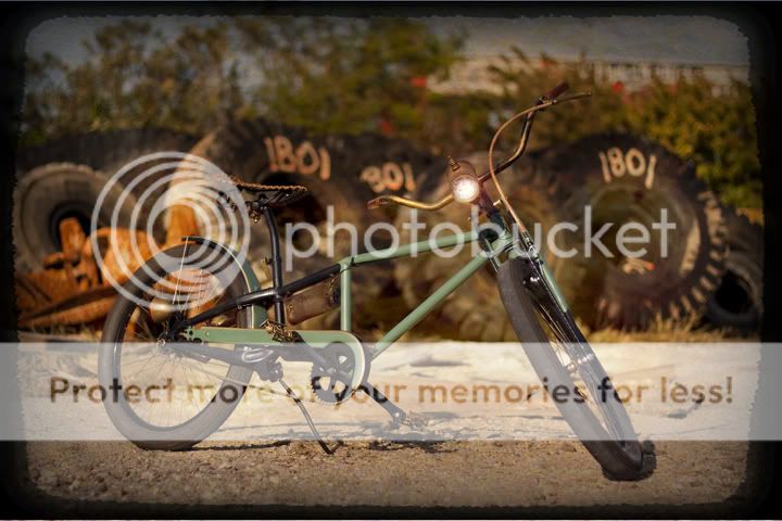
Not sure if this is a perfect sample of what has been discussed so far but notice:
1) bike fills frame.
2 ) Unusaul angle. I was laying on the ground, not standing up.
3) Late afternoon light. See shadow going more towards the back then straight down
4) bike away from the background.
5) slightly shallow depth of field (focus). Bike sharp so it helps it pop off the background.
As to Photo shop work:
1) Used one of my edges from an old polaroid I had.
2) Vignetted the edges to keep your eye inside the frame. ( a little heavy but was going for a look)
3) created the glow to make the headlight look like it was on.
Hope this helps put a visual on the discussion.

The Renaissance Man
__CERTIFIED DIVER__ (Open Water & Open Dumpster)
Staff member
Moderator
Pro Member
I would suggest to do some home work before setting out to shoot. We have all looked for inspiration and ideas for things pertaining to building the bike, so looking at pictures for ideas on how to frame a good shot is not very different. The real difference is looking at the composition instead of the subject.
Everyone has been making good points!
The one pet peeve that I have is using a brick or a big chunk of wood to raise the kick stand off the ground! A trick that I've used is a socket. I have a set of impact sockets that are black or I have wrapped one in black masking tape also to try to minimize the focus.
Here's an example...
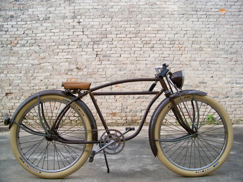

I found this pic on the net but it has a couple things that I like to do when setting up a photo shoot. I don't just look at the background and the lighting, but I look at how everything flows. That includes the pedals, cranks and especially the valve stems. Place the cranks either horizontal or vertical with the ground, not at a random angle, the pedals should both be at the same angle too, not having one at 33 degrees and the other at 246 degrees, plus put the valve stems in the same location on both wheels. I know this sounds petty but many years of art and design school and work has made me a little anal retentive about the small stuff. When I do a photo shoot on a hot rod I make sure the hub caps/wheels are all at the same position too.

This is a poor quality pic, another one taken from the internet, but this really shows how the composition flows when everything is in line. I can be a photo nazi on the small things or maybe it's a little OCD.


This is a poor quality pic, another one taken from the internet, but this really shows how the composition flows when everything is in line. I can be a photo nazi on the small things or maybe it's a little OCD.

Keep your fingers and toes out of the shot, that's all I got... I'm kinda afraid to post pics now...
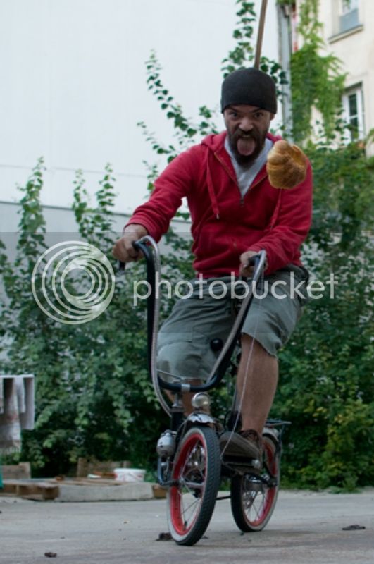
Actually, I love this shot by our good friend irzouts. Is shows the kind of spirit and good-natured attitude I associate with bicycles. It may not be the best composition (NOT saying it's bad!) but something about it makes me smile. Irzouts, yer a winner in my book! The bike is Stella Bread Racer from a previous build-off.
Rg
Rg


$99.99
$108.99
Schwinn Toggle Quick Build Kids Bike, 12-Inch Wheels, Smart Start Steel Frame, Easy Tool-Free Assembly, Blue
easiness

$152.99
$179.99
cubsala Freestyle BMX Bike, 18 20 Inch Kids Bicycle for 5-13 Years Old Kids and Beginner Level Rider, Multiple Colors
funwheels
$199.99
$229.99
Huffy Stone Mountain Women's Mountain Bike, Gray, 26 Inch Wheels/17 Inch Frame
HuffyDirect

$19.99
Electra Glide Wall Decal 2ft Long Sport Harley Davidson Bike Motorcylce Sticker Man Cave Garage Boys Room Decor
FatCat Wall Graphics
$18.99
Old River Outdoors Bicycle/Motorcycle Chain Picture Frame 4" X 6" Photo - Faux Bike Chain
Old River Outdoors (USA Merchant)
Here is what I've learned about photography and subjects.
It is all about the framing of the subject.
My wife is an Actress so I take her pictures.
With dealing with subjects (such as my wife and her other actress friends)
Framing makes the shot.
Too much clutter in the background makes a bad shot.
When ever my wife has a hair style change etc. It is time for new headshots.
We do some test shots and scout areas (we have found this to be the best approach due to weather changes and location changes).
We have also found so far natural light works best ( I use a cheap reflector to bounce the natural light on the subject (no flash)).
I've seen a lot of bike shots cant make out what I'm looking at due to blurred images, reflector bounce etc.
Some cameras the more you zoom the more the blur.
Try and keep the subject tight focus.
make sure there is nothing incriminating in the background and check for mirrors.
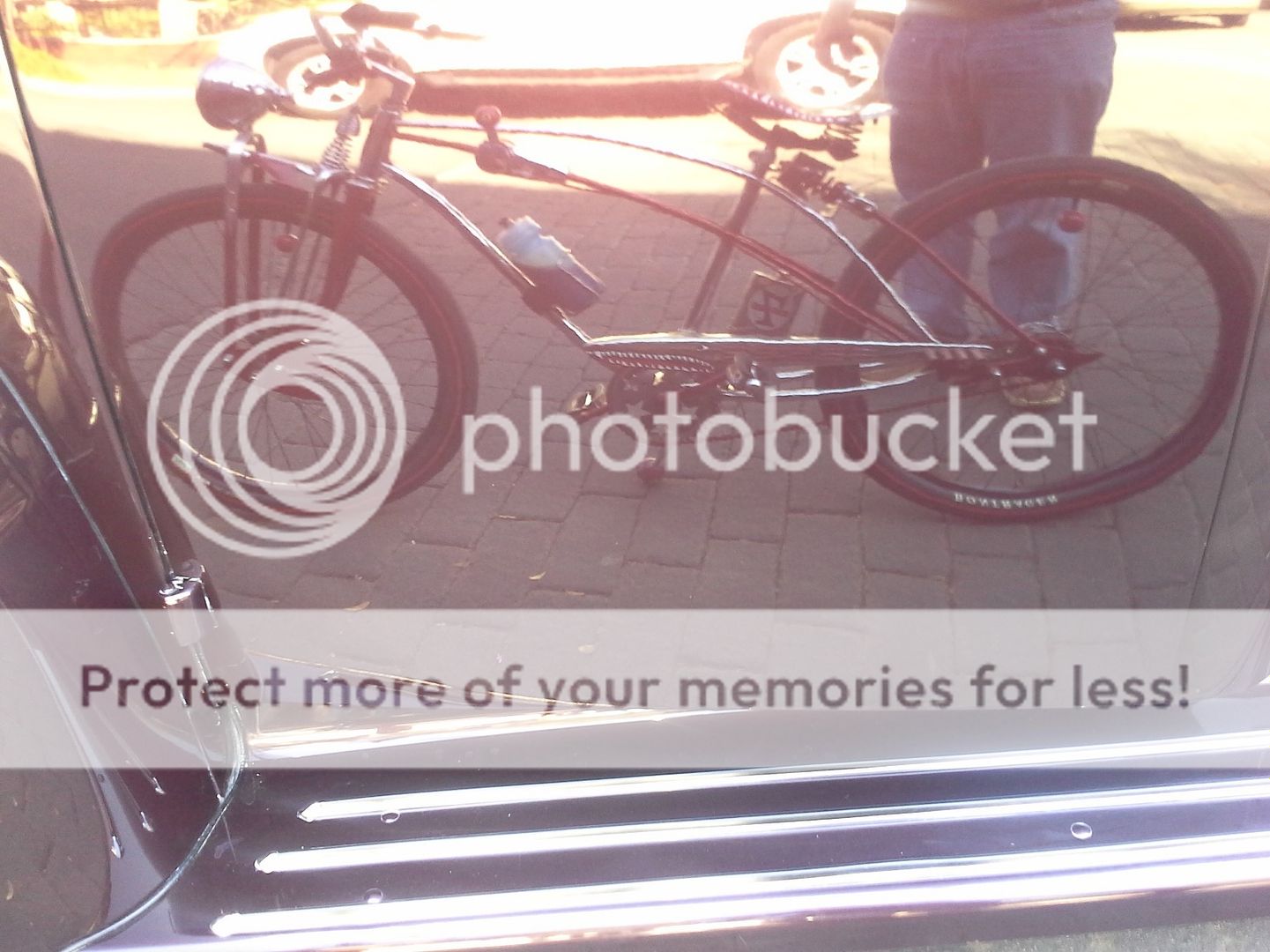
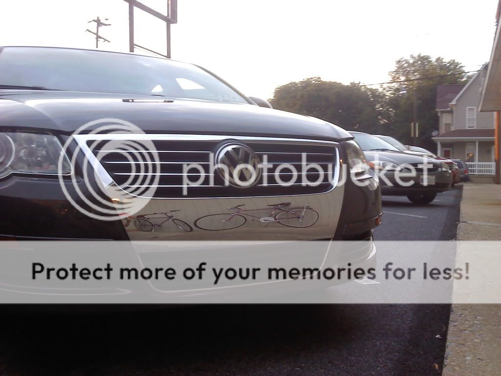
Or you can use mirrors and reflections for fun.
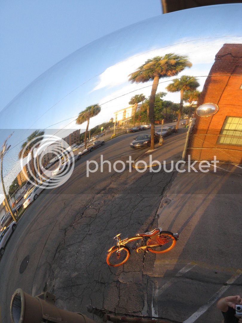
Ok, here's an opinion question, what about component posistioning?
Such as seat and bars.
I like to see the seat up, at ride height, others I have read prefer them down for photos....
Such as seat and bars.
I like to see the seat up, at ride height, others I have read prefer them down for photos....
And anything else, as I found out today... A little cutting oil from using the lathe yesterday must have flicked onto the lens of my camera...And check your lens for finger prints!!!!
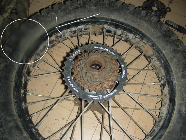
Luke.
[quote="LukeTheJoker]And anything else, as I found out today... A little cutting oil from using the lathe yesterday must have flicked onto the lens of my camera...
Luke.[/quote]
Either that or that part of the tire is blurry?
Luke.[/quote]
Either that or that part of the tire is blurry?

Ok, here's an opinion question, what about component posistioning?
Such as seat and bars.
I like to see the seat up, at ride height, others I have read prefer them down for photos....
Depends on the build. I think a lot of builds have the seat slammed for the coolness factor. I remember a few times hearing the saying "Low for show, Up for go" meaning some people put the seat low to show off the build, but sometimes raise it up when they are actually riding it.
I like the reflection thing too.Or you can use mirrors and reflections for fun.

Here I tried one with a cheap cell phone and my RRBO#7 bike...
My photos have been on the weaker side in the past, I think, but my spot for my final pics has been picked out for a while this time. My wife found a spot that I think will be awesome.
Do not cut off any of your bike, even the edge of the tire.
Make sure you have enough film. and that its the right iso. I like Fuji 100.... oh wait, nevermind. But make sure your lens cap is off
Take multiple shots. Digital "film" is free now days. Take what you think is your best shot, then move to the left and take another, then move to the right and take yet another. I can guarantee that one will be better than the others. Be your own harshest critic. Look carefully at your photos. If your photo is full of problems, don't use it. Go out again and re-take until you get a better image. JMHO.
MazdaFlyer
Like “RadioFlyer”
In looking through the final bikes listing, I would say that the overall photography is up a few notches this year. Some great photos and backgrounds showing up! Nice work fellow builders.


