Help with drawing a logo?

Rat Rod Bikes Bicycle Forum

Help Support Rat Rod Bikes Bicycle Forum:

This site may earn a commission from merchant affiliate links, including eBay, Amazon, and others.
Joined
Dec 31, 2011
Messages
808
Reaction score
64
Location
Staples minnesota
Rating - 0%
0   0   0
Hey everybody, I've got a question. Could anybody possibly give me a hand in drawing kind of a logo? around my place I'm doing some bike repair/ selling of used bikes like almost everybody else on here. But being so darn far out of town (and many other encumbering factors) not many people take me seriously.

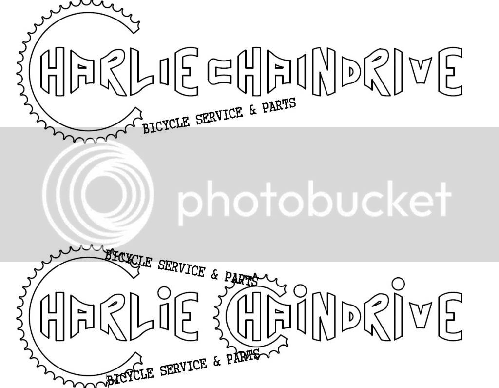
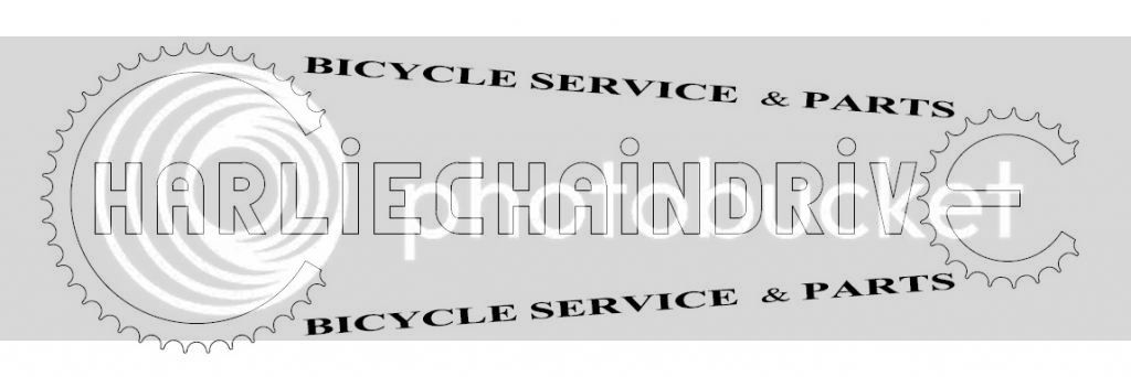
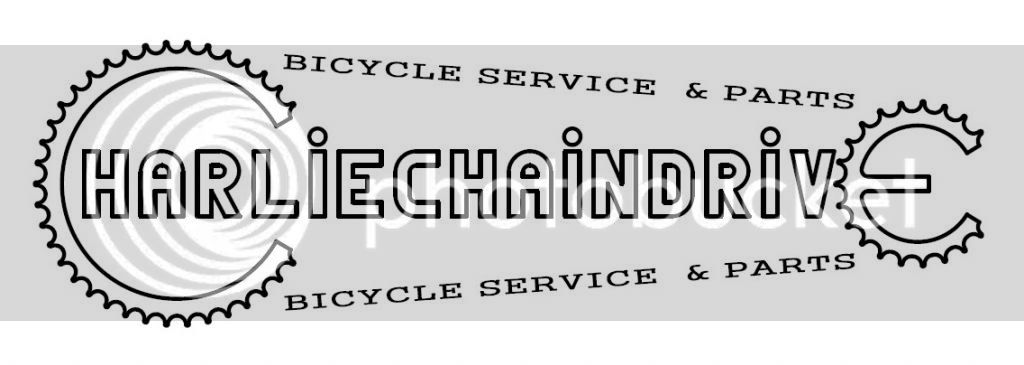
What I'm thinking of is just a simple design, my screen name charliechaindrive, with the first C being bigger than all the other letters and being toothed like a sprocket. so it would kinda look like this

CHARLIECHAINDRIVE'S
Bicycle repair and sales

Inside of a double edged oval. Is anyone good enough at drawing/computer illustrations to help me out with this? Thanks in advance

Ccd
 
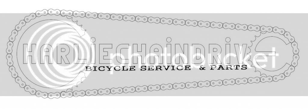
Rather than a double edge oval, how about a sprocket at each end with a chain around the whole thing making an pill like shape with the lettering inside it all.
 
kingfish254 said:
Rather than a double edge oval, how about a sprocket at each end with a chain around the whole thing making an pill like shape with the lettering inside it all.

Rather like that Idea myself KingFish!!!

I can see it now...

"Wolf's Bicycle Repair & Restoration" with a big chain loop & sprockets around it!!! :lol:

Talk Soon!
Blessings!
Will & Wendy,
 
Awesome work Jim!
 
What about making the "e" in drive the sprocket? that way the chain can be the oval surrounding the name? not sure if this is making any sense..... the chain would go from the "C" in Charlie to the "e" in drive, surrounding the other letters. A quick and classic style logo, that's just my opinion.
 
FATMAN said:
What about making the "e" in drive the sprocket? that way the chain can be the oval surrounding the name? not sure if this is making any sense..... the chain would go from the "C" in Charlie to the "e" in drive, surrounding the other letters. A quick and classic style logo, that's just my opinion.

Hey I like your idea fatman! Let's see what jim comes up with. Thanks for the help everybody!
 
His call hehehe! I was actually thinking drawing in a chain, that way he gets the boarder he likes, fit the "bicycle service and parts" underneath the name, but either inside the chain or outside the chain. Outside the chain would probably give it a better balance. Again, just putting in my 2 cents.
 
That looks even better.
I think it looks perfect right there.
 
That one looks great! i can imagine if the chain had a heavier weighted line, it would draw to much attention to it and not the name.
 

Latest posts

Back
Top