You are using an out of date browser. It may not display this or other websites correctly.
You should upgrade or use an alternative browser.
You should upgrade or use an alternative browser.
Rat Bike News Magazine wants you!
- Thread starter xddorox
- Start date


Help Support Rat Rod Bikes Bicycle Forum:
This site may earn a commission from merchant affiliate
links, including eBay, Amazon, and others.
here's a fake cover I did awhile back.
viewtopic.php?f=1&t=3878&st=0&sk=t&sd=a&start=30
viewtopic.php?f=1&t=3878&st=0&sk=t&sd=a&start=30
I agree with some of the others, I like the 1st and 3rd. I think the whole Iron cross thing has been overdone. I think the first one would look cooler if the striping was more of a vibrant color, it looks kind of pink and I think it would look better a bright red. My 2 cents.
Rat Rod
Owner & Founder
ratdaddy said:here's a fake cover I did awhile back.
viewtopic.php?f=1&t=3878&st=0&sk=t&sd=a&start=30
Ah Ha!....that's where that thread was. :mrgreen:
I like the top two.
I really like the one with the wheel, with the tatoo writing. I also like the one with pinstriping, But the pinstriping looks faded. I'd like to see it with a solid black, red and white striping scheme.
I like the 1st one best and then the 2nd one. Don't care for the other 2. The first one, if you couldn't even read , just looks right with the old school striping. I like it a lot. But then again you could take all that I know, put it in a peanut shell with the nuts and they would still have room to rattle around. Just kidding. Number one would be my choice. Looks great.

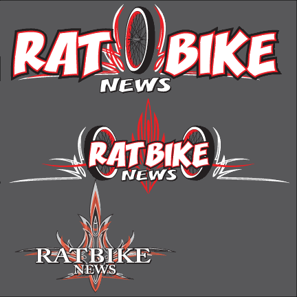
I like the striping int the first one, with the two tones behind the words, and the 2 wheels in the second one. If I hadn't seen the one wheeled, two-toned striping in the first one, though, I would think the second one was awesome. :mrgreen: