COLUMBIA BUILT BAR HOPPER

Rat Rod Bikes Bicycle Forum

Help Support Rat Rod Bikes Bicycle Forum:

This site may earn a commission from merchant affiliate links, including eBay, Amazon, and others.
This is just my ‘logic’ on this....the 20” model was made to imitate the 26”.
Because the target user was under 12 (in most cases (remember this is the pre-musclebike era). The geometry/ride comfort/overall design ‘balance’ wasn’t a big deal.
All baby brother wanted was a bike to look like his big brother’s.


Sent from my iPhone using Tapatalk
 
This is just my ‘logic’ on this....the 20” model was made to imitate the 26”.
Because the target user was under 12 (in most cases (remember this is the pre-musclebike era). The geometry/ride comfort/overall design ‘balance’ wasn’t a big deal.
All baby brother wanted was a bike to look like his big brother’s.
If you look at juvenile bike ads from the pre-muscle bike era, the age range listed on the 20" bikes is pretty universally 5-9 years old. By around 12, or so, the expectation was to be on a 26" wheeled bike.
 
This is just my ‘logic’ on this....the 20” model was made to imitate the 26”.
Because the target user was under 12 (in most cases (remember this is the pre-musclebike era). The geometry/ride comfort/overall design ‘balance’ wasn’t a big deal.
All baby brother wanted was a bike to look like his big brother’s.


Sent from my iPhone using Tapatalk
Comparing the two frames, the 26" looks humped up in the middle, while the 20" looks long and laid out (after fork change). All the angles are the same when using the original forks on the 20" frame. Except the tank, which was at an angle, unlike the 26" frame. I guess the tank had to be angled by design to keep the seat height low enough for a young rider. Function over form unfortunately. The bizarre thing is that the 26" bike has an original kickstand that is too short and the bike falls over easily.......just like the 20" bike did with the original forks on it. Columbia bikes had many design features that were different from industry standards. Not all of them good.
 
It's pretty cool how just lowering the front makes this bike look. It screams Hot Rod!

I wonder how it would look if you moved the seat back a few inches.
 
It's pretty cool how just lowering the front makes this bike look. It screams Hot Rod!

I wonder how it would look if you moved the seat back a few inches.
I originally did just that. I put a small seat on an old "7" seat post and laid it back and down on the back tire. I was very surprised when I stood back to take a look at it. It looked terrible! Then I figured out why. If you draw a vertical line in front of the back tire -and- a vertical line just behind the front tire...........you will see how the seat and the bars/stem are all kept between those two imaginary vertical lines. For some reason, that is how this frame design looks the best. I believe that it makes the bike look longer and lower. It also kind of divides the bike into three segments: front tire area, body area, and rear tire area. That is exactly why I don't ever have a concrete version of any build before I start. I only have visions. Then I experiment with different ideas and components during the building process to see what works. I have had many builds turn out completely different than my original vision.
DSCN1027.JPG
 
One of my favorite aspects of the vintage Columbia bikes is their beautiful art-deco chainguards. I had originally intended on using one for this build. Unfortunately, I think that they were all 26" versions. Way too big for the 20" bike???
DSCN1047.JPG
 
Last edited:
Tim, I made that 'fat tire' comment before you had the present ones mounted. I like the old skool slick and front tire combo the way you have it now. Plus, with the new fork, a really fat tire wouldn't have the same effect.

The 26" guard to me takes away from the lines and 'long' look you have achieved with the fork addition.
 
Yes. Way too big
That is why I do mock-ups. On to the next idea. Found this 50's Columbia short-tank online for cheap. My plan is to try to make it into a chainguard that looks original to the bike. It's perfect because it's short and has the same rocket shape in the middle that matches the tank graphics. Going to do a red and white 2-tone to match the bike colors. Hopefully, I can accurately reproduce the patina to match the rest of the bike.
s-l1600.jpg
DSCN1050.JPG
 
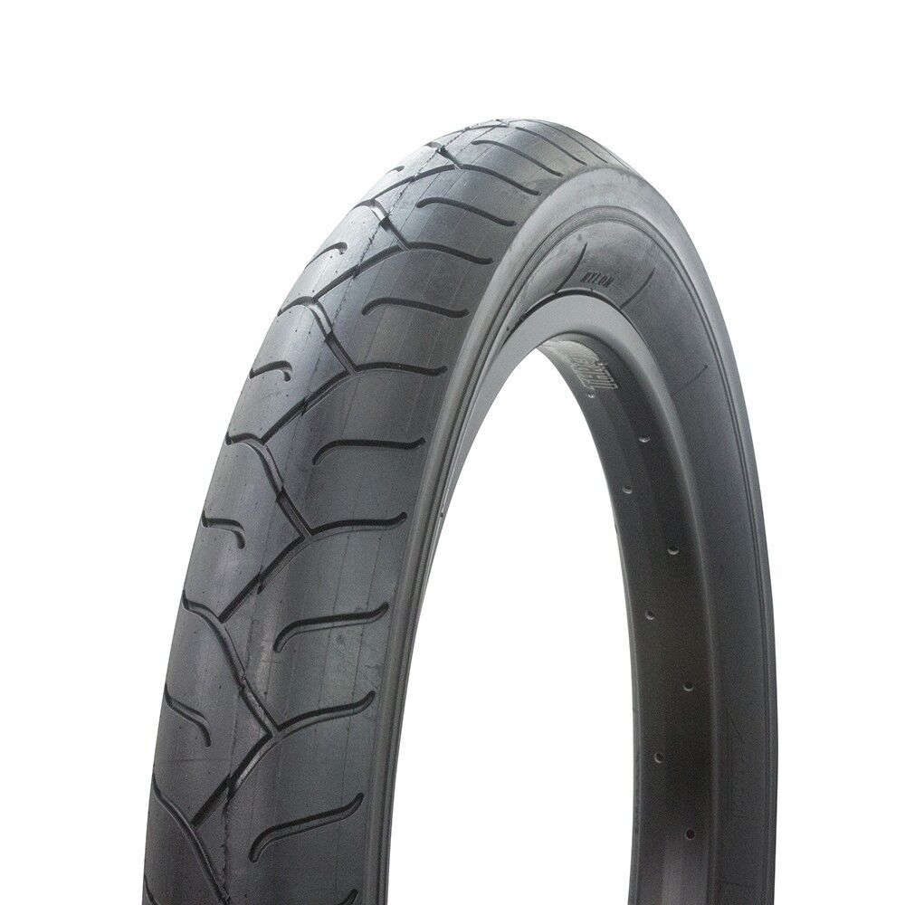
I am really excited about how this build is progressing and evolving. Unfortunately, now that the bike is stretched out and long, those cool vintage tires look way too skinny. And like OddJob said.........this frame design begs for more. I am betting that fat tires will get this bike closer to that "Bar Hopper" attitude that I am wanting for this build. I have ordered a new set of 20" x 3.0" all-black cruiser tires. The challenge is fitting 3.0" tires into 2.8" clearances without rubbing. But I think mounting them on the skinny rims will give a slightly narrower overall width. Maybe it won't work. But I just have to see what it looks like with fattys on it. Call it an attitude adjustment!

s-l1600.jpg
 
Tim, I made that 'fat tire' comment before you had the present ones mounted. I like the old skool slick and front tire combo the way you have it now. Plus, with the new fork, a really fat tire wouldn't have the same effect.

The 26" guard to me takes away from the lines and 'long' look you have achieved with the fork addition.
We will see if the fat tires are a good idea or not. Something tells me they will look good if I can squeeze them in there. As for the chainguard, I want it to keep a very minimalistic look to it.......just like the (juvenile) seat, (juvenile) pedals, and (small) chainring. I might switch to smaller grips also. Using the smaller components gives the illusion of the bike being larger than it appears. That's why I want the 3.0" tires. Hopefully, they are going to look obnoxiously huge. Playing some tricks with proportions.
 
Last edited:
Back
Top