Midriff-ter MTB...My home from May 1 - Aug 1...pg 15 !

Rat Rod Bikes Bicycle Forum

Help Support Rat Rod Bikes Bicycle Forum:

This site may earn a commission from merchant affiliate links, including eBay, Amazon, and others.
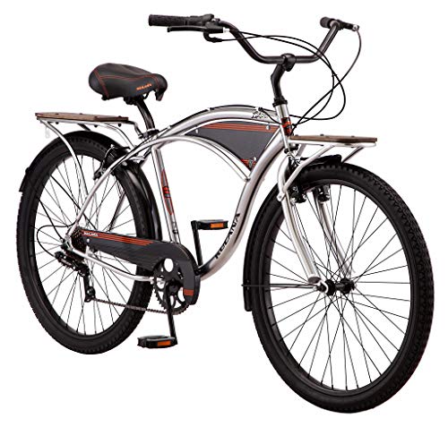
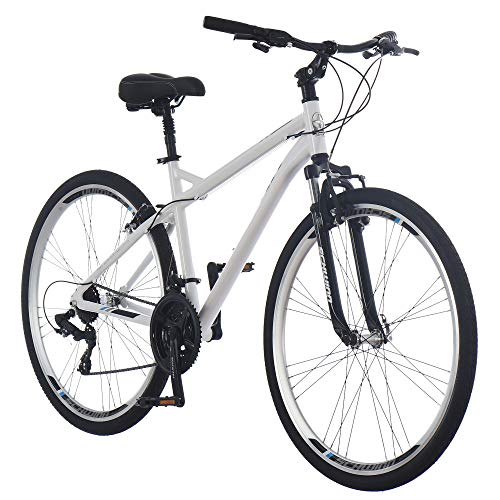
I like 5 & 2 for the same reasons yet they are quite different (gosh, I sound like an Ann Rice book). Pic 5 The patina and orange lettering are slightly absorbed by the backdrop but the blue lines of the frame separate the bike from its backdrop. Pic 2 does the same thing. It has blue and lighter hues similar to the gray of the backdrop that the backdrop "pulls" from the frame. The orange hues of the patina pull the frame lines back out of the background to make a statement. So the question to me would be which color would I want to be more prominent? Black is black, it looks good in both scenes and sets the visual boundaries of a great looking bike. I must be tired, I'm rambling.....😴
🛏️💤
 
@68z27 , I completely understand where you are coming from. That's the issue with having a bike with opposing colors on the color wheel. If you 'driff-t' too much towards one in the background, it starts to blend in and loses it's impact.

I could find a more neutral background of a wall (such as in pic #6 of the BACK 40 ) but I think I want a natural setting in the wild, to accentuate the 'mountain' part of the mountain bike build.

Thanks for your input!
 
Wellll, If worst comes to worst you could send your bike to me and I will make every attempt to find as many different backdrops as possible in order for you to enjoy the pics. I'll even pay for the shipping!!! :p
 
Wellll, If worst comes to worst you could send your bike to me and I will make every attempt to find as many different backdrops as possible in order for you to enjoy the pics. I'll even pay for the shipping!!! :p
What's your address?
 
No, No, No! I have taken new steps from receiving hate mail, eggs thrown at my house, and toilet paper thrown in my trees (if I had any). I'm not gonna fall for THAT trick for the tenth time......:rolleyes:
 
Late to the party, but 3 & 5.
5 has better contrast, but 3 appeals to me as well. Keep 'em comin'!
Thanks John! Photo #3 really has the aesthetic I am looking for, but I like the clarity of #5.
 
I also like three for the surroundings but the exposure hurts it. If you can go back there during the golden hour or on a cloudy day maybe you can capture a good shot.

240311-20230708-094700.jpg
 
So, here are some favs from the first round of photos, the ride photos from Battle Creek, and a short 'golden hour' ride I took after work tonight to our Applewood Park across the pond. (no, not that 'pond') :grin:

1. Carver Lake Trails


Final Photo 9.jpg


2.


Final Photo this one.jpg


3.

Final Photo 2 PLUS.jpg


Battle Creek Trails
4.
BC 3 modified.jpg


5.


358802510_806978294293474_394996549325569127_n.jpg


Applewood Trails tonight
6.


Applewood golden 1.jpg


7.


Applewood 2.jpg
 
Man! I really like #2 with the gloves on the fence. Really gives the bike a feeling, that it has been worked hard and is taking a proud rest. I was researching a lot of photos on the net for inspiration and many had this vibe, but none had the feeling like your #2 photo. And the background is forgiving enough to show off the bike properly. 💪🏻
 
Back
Top