Cool Bike! I think the first one works better with the lines of the frame.
- COMPETITIONS
- THE COMPETITION ARCHIVES
- RRBBO OFFICIAL COMPETITIONS
- BUILD OFF 9 - (2014)
- BUILD OFF 9 BIKES
You are using an out of date browser. It may not display this or other websites correctly.
You should upgrade or use an alternative browser.
You should upgrade or use an alternative browser.
Stray Cat...."The Cats Ready to Prowl"
- Thread starter cherrydeuce
- Start date

Help Support Rat Rod Bikes Bicycle Forum:
This site may earn a commission from merchant affiliate
links, including eBay, Amazon, and others.
Both schemes look really good!
I like the curved lines best, but the darts on the first one would be easier to mask. Tough call.
Thanks Reno Man, either won't be too difficult, at least that's what I'm telling myself.
 I'll make a stencil to make sure I get it symmetrical.
 Bike has zero curves, my thought was mimic the spike/triangles in the design but it's kinda like a visual prick.

Number two, tried to softened the lines...I'm liking that one a little better too, less bloody eye's.
+1Cool Bike! I think the first one works better with the lines of the frame.
Good to hear the feedback with fresh eye's guy's thanks!!!!
Since it seems #1 is a fav among the replies, the biggest reason I was leaning away was the busyness... I think I just should've stopped at an earlier version, it was simple and clean. Here's it next to the other one.
New #1
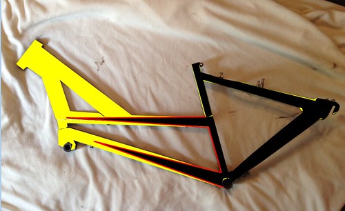
Old #2
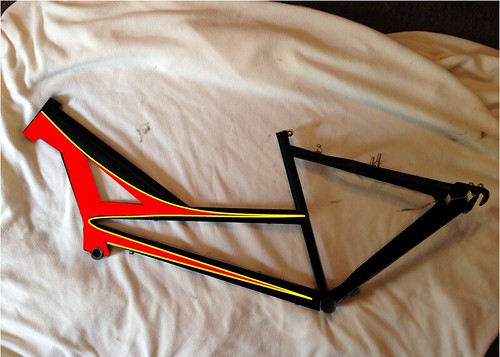
New #1

Old #2

Last edited:
That one looks good too!
Luke.
Luke.

$19.99
Electra Glide Wall Decal 2ft Long Sport Harley Davidson Bike Motorcylce Sticker Man Cave Garage Boys Room Decor
FatCat Wall Graphics
$199.99
$229.99
Huffy Stone Mountain Women's Mountain Bike, Gray, 26 Inch Wheels/17 Inch Frame
HuffyDirect

$99.99
$108.99
Schwinn Toggle Quick Build Kids Bike, 12-Inch Wheels, Smart Start Steel Frame, Easy Tool-Free Assembly, Blue
easiness
$18.99
Old River Outdoors Bicycle/Motorcycle Chain Picture Frame 4" X 6" Photo - Faux Bike Chain
Old River Outdoors (USA Merchant)
$249.40
$289.67
Kulana Lakona Tide Adult Beach Cruiser Bike, 26-Inch Wheels, 7-Speed, Silver
Amazon.com
I like #1 the best
either #1 are good...
Build it man...you won't wanna get off it. I'm starting to collect parts myself for my own burrito too.
This ones necked and ready for some spray, waiting on the sun to show it's face to lay it on.
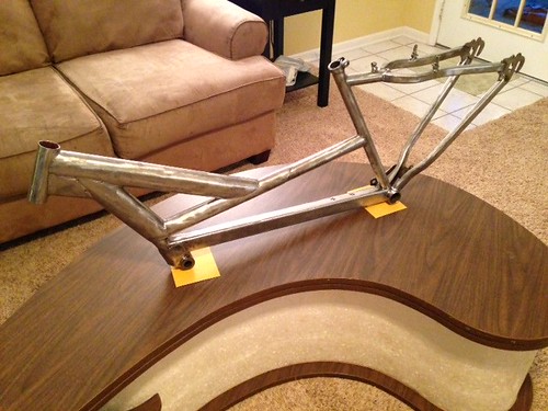
I see you are using my coffee table as a work stand!! I like the first design but what would it look like if you reversed the color scheme?
"Work Stand" sheez those things are all over thrift stores here in my area!I see you are using my coffee table as a work stand!! I like the first design but what would it look like if you reversed the color scheme?
The color swap would look great but since the frame is thick in the front and I was trying to counter act the visual weight by the darker/heavier color on the back.
Might look good to make the black or yellow, or both, a suede finish with gloss red pin strip!
Yeah, like I said before, your thrift store sucks! You're right, I stared at the pix for a few minutes and the yellow does need to be more prominent. It will definitely offset the weight of the black. Looks very cool Deuce."Work Stand" sheez those things are all over thrift stores here in my area!
The color swap would look great but since the frame is thick in the front and I was trying to counter act the visual weight by the darker/heavier color on the back.
Heck yeah!A little birdie told me you got some paint on the frame?
I'll post some pics tonight so everyone can see I'm concurrently building and within BONINE rules....... as if anyone cares... Haha

What a weekend! So the bike is done, as you know I used BONINE to create a bike and donated it to a fundraiser, the events this weekend and I due to turn it over today to organizers. This was a busy weekend with Family time taking up most of my time I only had Saturday night starting at 10:30 to get it wrapped up. Here's what it looked like on Saturday...
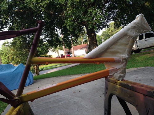
And here's what it looked like Sunday morning...
Yep...all-night... 6 hours later
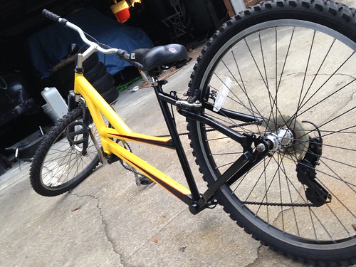
I spent Sunday afternoon after church taking her on a last ride and here are some pics from that trip, enjoy!
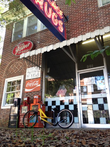
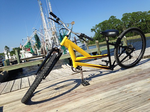
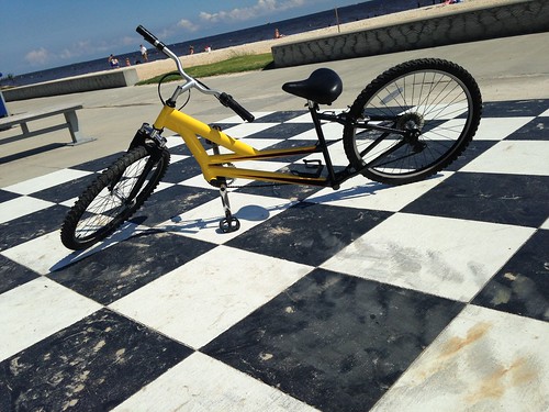

And here's what it looked like Sunday morning...
Yep...all-night... 6 hours later

I spent Sunday afternoon after church taking her on a last ride and here are some pics from that trip, enjoy!


Paint came out nice, well done!
Luke.
Luke.
Thanks Bummer! Super Easy and so much fun!That turned out great. It looks easy to ride too.
Great paint job on it. Looks great. Reall need to get my finger out and make a start to mine
Sent from my GT-I9100 using Tapatalk 2
Sent from my GT-I9100 using Tapatalk 2


