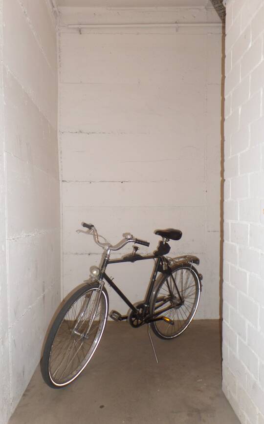
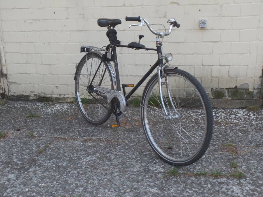
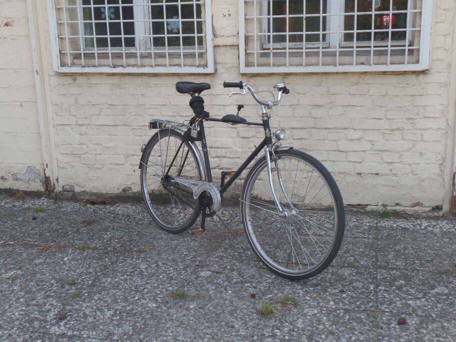
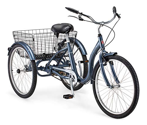
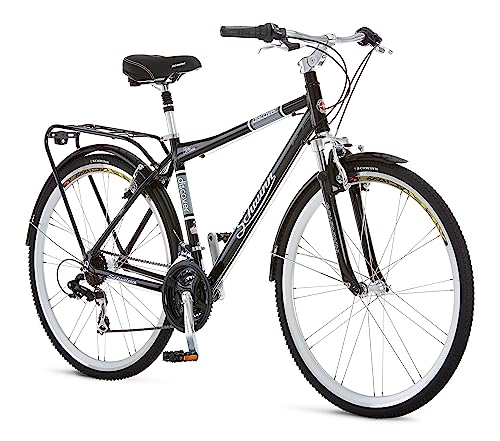
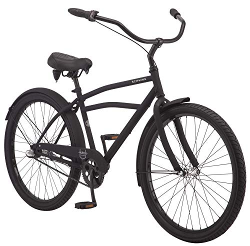
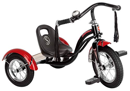
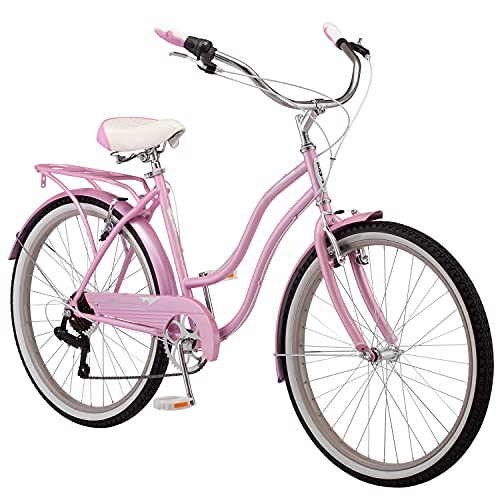
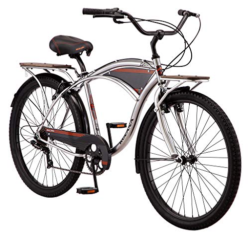
1. Your backgrounds are quite muted, and the bike has very few colors, except for the pedal reflectors. What I suggest is load the photos on your computer and play with some really simple editing programm (like Photofiltre, you don't need Adobe for that) and just play a little with the contrast setting just to make the bike pop, to look add a little more depth. It will show the chrome better too.
2. Also are you using a phone to shoot the pics? Try tapping on the center of the bike to make the camera focus on it so the background isn't so clear, that helps too with perspective and image depth.
3. You shoot in 4:3 aspect ratio, but for final pics you should use the 16:9 wide-screen setting - because it is much closer to the way the human eye actually percepts the surroundings, which is mostly due to the fact we have two eyes instead of one. Your field of vision is like that:
View attachment 102665
That's the reason why movies are more enjoyable in wide-screen format than on a 4:3. Actually TV sets were 4:3 only because the technology decades ago wouldn't allow for wider screens.
So 4:3 removes you from the object while widescreen immerges you in the picture.
View attachment 102666
I, at least, find the pics on the right more pleasing.
I like all three photos, great angles, hard to pick one. The white brick wall pics are also quite good. You are not adding the dynamo to the fork just for looks? And what about the pump, I see you have an integrated pump holder on the down tube?


