SaltHammer Savannah Sand Flats Silver King (1935 Monark Silver King) - Aug01 FINISHED! What A Blast!

Rat Rod Bikes Bicycle Forum

Help Support Rat Rod Bikes Bicycle Forum:

This site may earn a commission from merchant affiliate links, including eBay, Amazon, and others.
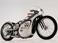
Did a simple mock with tape. Picture the masking tape as yellow.

20160717_150254.jpg
 
I like the red better. Red rims too, correct? The red under the fenders needs to be darker to match the rims, but that's a great look with the red underneath. Gaskill's lettering is cool and will stand alone fine without the color coordination. If you need some continuity use the gold to outline the red stripe instead of white. Just thinking out loud brother, but ya gotta know red is right next to flat black in ratrodding....

Carl.
 
Hmmmm with your pics. above seeing the red on the rim and inside fenders then picturing the yellow/black on fender and your other pics. with goldish lettering on tank. That's some contrast going on with the yellow but that's just me :blush: If you didn't have the red going on black the rims and inside of fenders then I diff. see the yellow working.
 
Feedback and gut checks are appreciated guys. Keep them coming.

I've always been looking at the red rims accent as nothing more as an homage to the redline hot wheels. It's a simple accent that really doesn't affect my color choices. But in the pic above its more prevalent because it's a close shot.

I'm also not going to try and match the tank lettering in regards to color.

Jake, I'm confused too. But it's fun pulling switcheroos like you.

Went and got some yellow tape to play around with some ideas.
 
Okay guys, I got some yellow tape that is lighter than Mooneyes yellow and started playing around with a few different striping ideas.

NONE of these ideas are set in stone, just playing around for all to see.

First one was on the guard with thick black outline of thinner yellow. Not feeling this one at all because it looks too much like a bee stripe.

20160717_174510 (2).jpg


Next I did the reverse of this. Thick yellow outline of black inner stripe. Better, but once I saw the total view, I don't think I am feeling the thick yellow. I'll retry this with thin yellow like I did my test fender stripes farther below. Also tested out using a Mooneye sticker as a medallion.

20160717_184359.jpg


On to the fender stripes. Went with a simple black stripe outlined with thin yellow.

20160717_184406.jpg

20160717_184351.jpg

20160717_190258.jpg


Then also tested a Mooneye sticker medallion on the nose

20160717_184934.jpg


Tried out a nose scallop. As you can tell, my black is electrical tape.

20160717_191149.jpg
20160717_191311.jpg
20160717_191318.jpg
20160717_191534.jpg
20160717_191656.jpg


20160717_191754.jpg
20160717_191802.jpg
20160717_191812.jpg
20160717_191825.jpg
 
I think if you're going black and yellow, the less yellow the better. Unless of course your bike will turn into a big honking robot.
 
I think if you're going black and yellow, the less yellow the better. Unless of course your bike will turn into a big honking robot.

Yeah, I am pleased with the fender stripes and especially the nose scallop, but I need to tone down the guard yellow to be thinner
 
Yeah, I am pleased with the fender stripes and especially the nose scallop, but I need to tone down the guard yellow to be thinner
maybe switch to gold or antique yellow instead of bright yellow ? i like the stripe desing , and wow , what a stunning job on the polish , my jaw dropped literally when i saw the pics :41::thumbsup:
 
In the last car hood pic, I really like the pin stripe design incorporated with the black stripe! And tbh, I like the back fender better without the scallop. Scallop almost seems 'too finished' looking....if that makes sense? I do like the thin outline on the the heavy black all around.
 

Latest posts

Back
Top